Crimson Hexagon Design System
Opportunity: Create consistency throughout the Crimson Hexagon platform by creating shared components.
Solution: Designed components using the Material Design framework. Created a shared Sketch library for other members of the UX team.
Timeline: On going
Role: This is an internal project led by myself and one front-end engineer. I coordinate cross team collaboration of component identification and building. I also maintain existing styles and create new ones as needed.
Biggest challenge: Limited resources. Somewhere between 5-10% of my time is dedicated to the design system, certainly not the time it deserves.
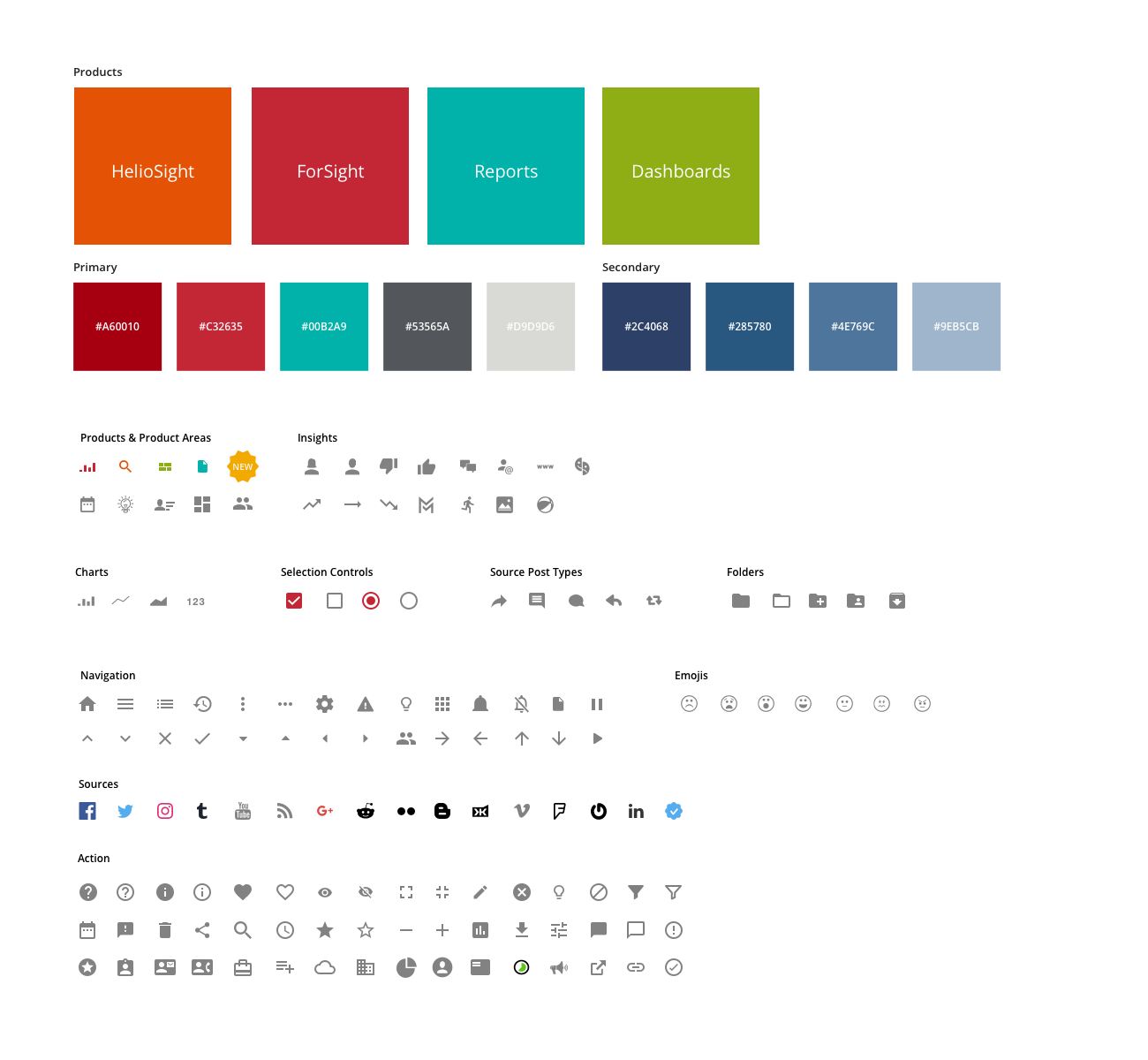
COLOR PALETTE & ICONOGRAPHY
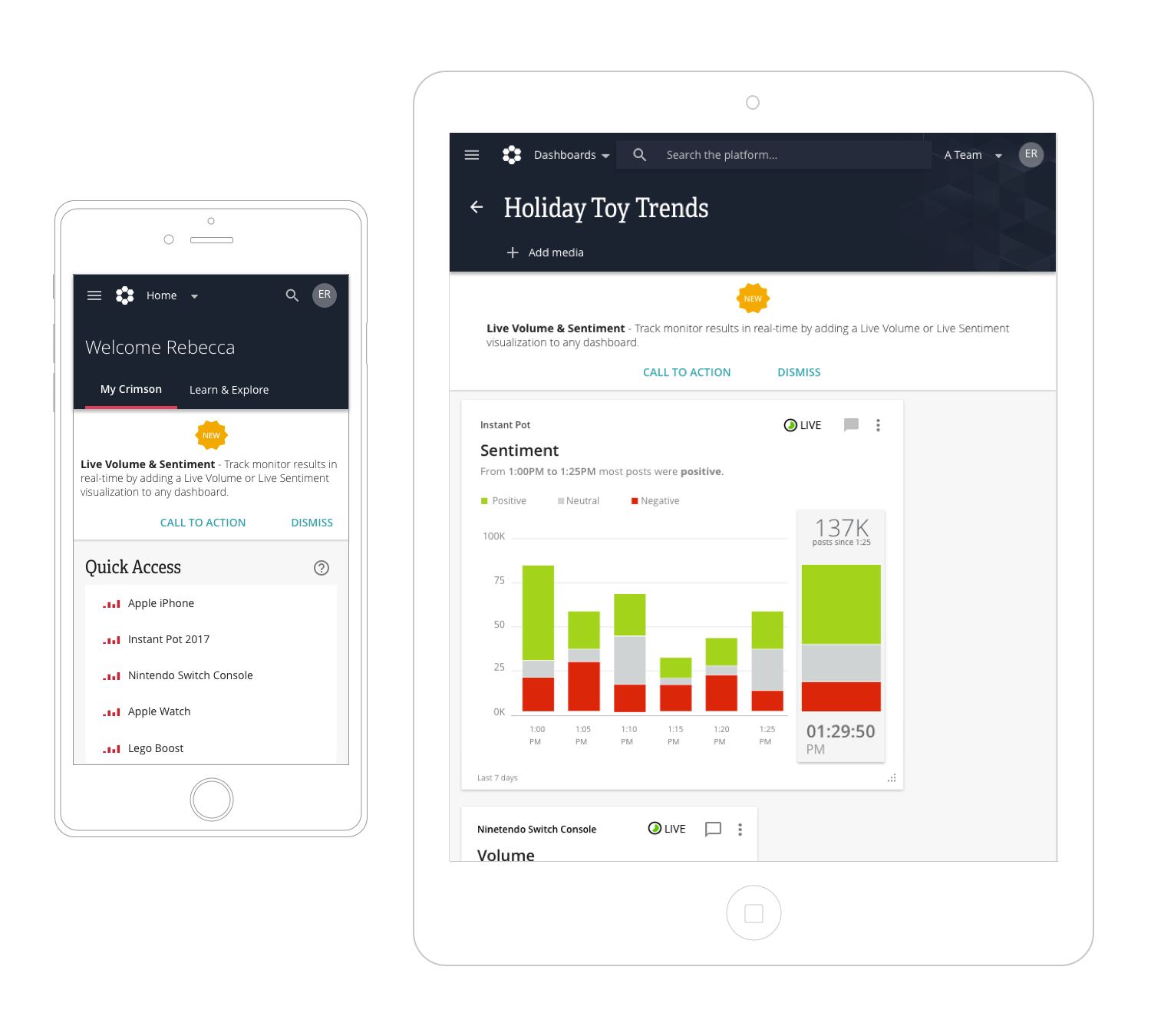
Banner component
Banner component across multiple product areas and devices.
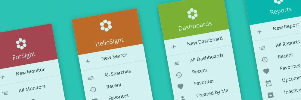
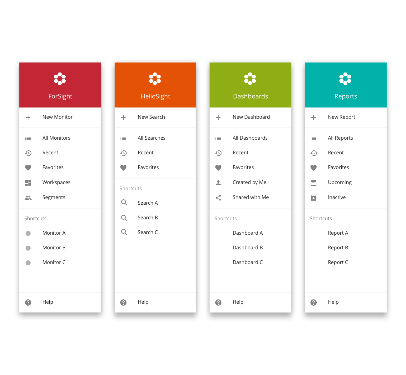
navigation component
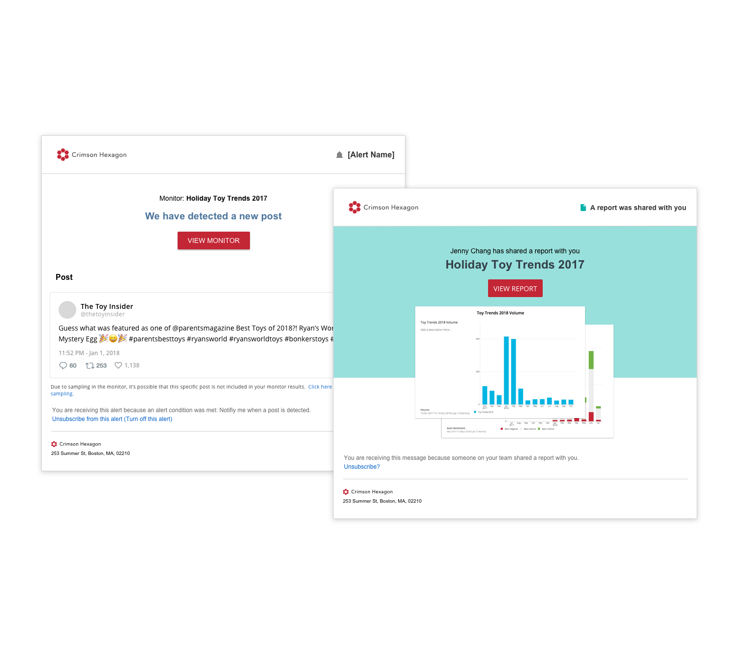
email templates
Left: Example of a ‘SmartAlert’ email template. Right: Example of a ‘shared report ‘ email template that uses elements from the design system.
